Binary options can be a highly profitable, but many traders are scared to perform market analysis for this form of trading. This articles shows you how to perform your own market analysis and find trading opportunities for winning trades.
You will learn:
- How to analyse price charts based on indicators and price action,
- How to compare price charts with different periods,
- How to understand the big picture of what is going on, and
- How find trading opportunities in any market environment.
With this information, you will be able to analyse the market for yourself.
Stock Market Analysis Example: Using Dow Jones For Binary Trading
Performing market analysis for binary options requires understanding the entire picture. You have to start on a long period and work your way down to shorter periods. While you will never directly trade these long periods, it is important to understand their effects, as they can override the effects of shorter periods.
When the market is nearing the 200-day moving average on a daily chart, for example, this moving average will provide strong support. Even if the 5-minute chart shows a downtrend, this trend is weaker than the chart event on the longer time frame and will override its effects. Traders that invest in a down option based on the short trend have made a bad prediction and will likely lose their trade. To avoid such mistakes, it is important to start your analysis with the longest relevant time frame, the daily chart.
We explain market analysis in four steps, and we will use the Dow Jones as an example. Let’s get started.
Step 1: The Daily Chart
For the Dow Jones, the daily chart looks like this:
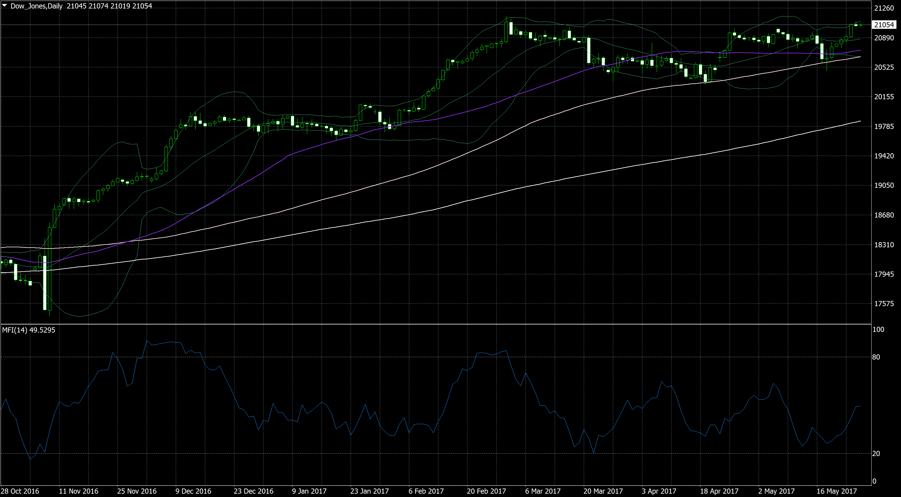
This chart uses a 50-day moving average (purple line), a 100-day moving average (bright pink line), a 200-day moving average (white line), and Bollinger bands (green lines). As you can see, we will rely on pattern matching strategies for the first part of our analysis. We will later add a technical indicator, but for now, there is no need.
You can, of course, use different indicators. The important point is not the type of indicators which we use, it is the approach from big to small and the relating of different time frames.
With that being said, let’s analyse the chart. There are a few things we should note:
- In the long term, the market is in an uptrend. There is an intact trend. Additionally, the three moving average are stacked from shortest to longest, and the shortest is the closest to the market – a strong sign of an intact upwards movement. Finally, the current market price is above all three moving averages, which means that they will keep being stacked this way.
- The uptrend has entered a sideways movement. The current uptrend started around 11 November. Until 6 February, it moved upwards at a pace that was impossible to maintain. Consequently, the market has moved mostly sideways since. Because of the strong upwards tendencies which we discussed under point 1, this sideways movement is most likely only a consolidation, not a turnaround. Sooner or later, the market will resume its original direction.
- Currently, the market is trading at the upper end of this sideways movement. The market is near the upper range of the sideways movement, which means it can do one of two things. It can break out of the sideways movement, which would open the way to much higher prices, or it can turn around and extend the current consolidation, which would lead to more fluctuating prices. Based on the current chart, the latter prediction seems more likely, but there is no way to know for sure. The market is even trading near the middle Bollinger line, which means that there is enough room for upwards and downwards movements.
This market analysis paints the big picture. Let’s see what we can learn about shorter periods.
Step 2: The One-hour Chart
The one-hour chart Dow Jones’ one-hour chart looks like this:
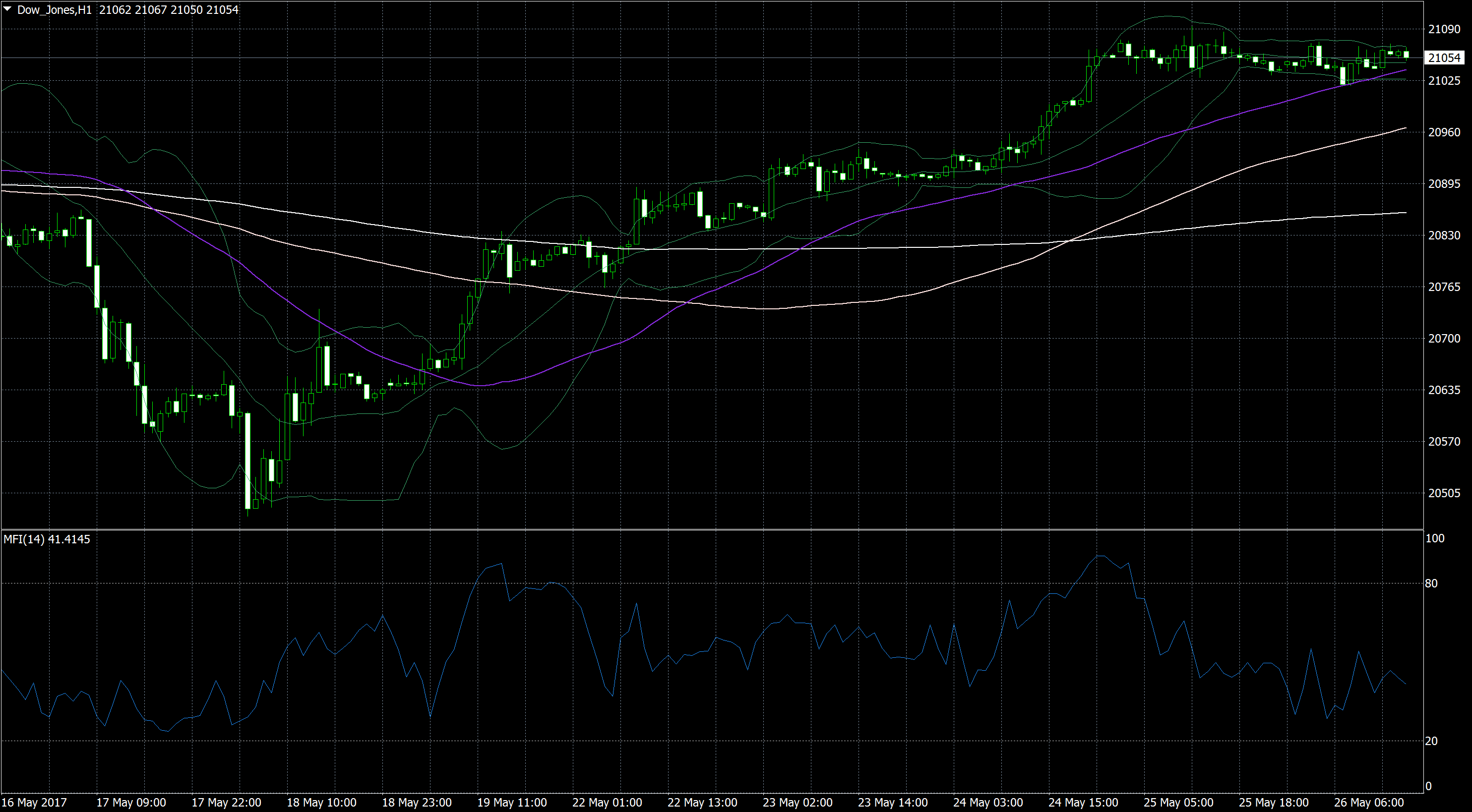
This chart looks very similar to the daily chart, but it is only the last part of it. The moving averages are stacked in just the same way, and there is a strong upwards trend that has entered a sideways movement.
We already know that the daily chart shows a movement near the top of its trading range. The fact that the hourly chart paints a similar picture is a strong indication that the market is on the verge of deciding what it will do next.
- If the market keeps rising, it will break through the daily chart’s resistance, which will unlock a strong upwards momentum.
- If the market turns around, it confirms the daily chart’s resistance and will continue its consolidation.
Continued Analysis Of Markets
Monitor the daily chart.
- If it shows a clear uptrend, you can think about trading a high option or an upwards one touch option.
- If it shows a clear downtrend, you can think about trading a low option, a low ladder option, or a downwards one touch option.
Until one of these trends develops, your options are limited. Your best option is to search for gaps that are accompanied by a low trading volume. These gaps are likely to close, which provides you with a clear prediction for a high/low option, one touch option, or even a well-timed ladder option.
For other strategies and further market analysis, we have to zoom on to the next shorter time frame.
Step 3: The 15-minute chart
The 15-minute chart shows a sideways movement with a clear trading range.
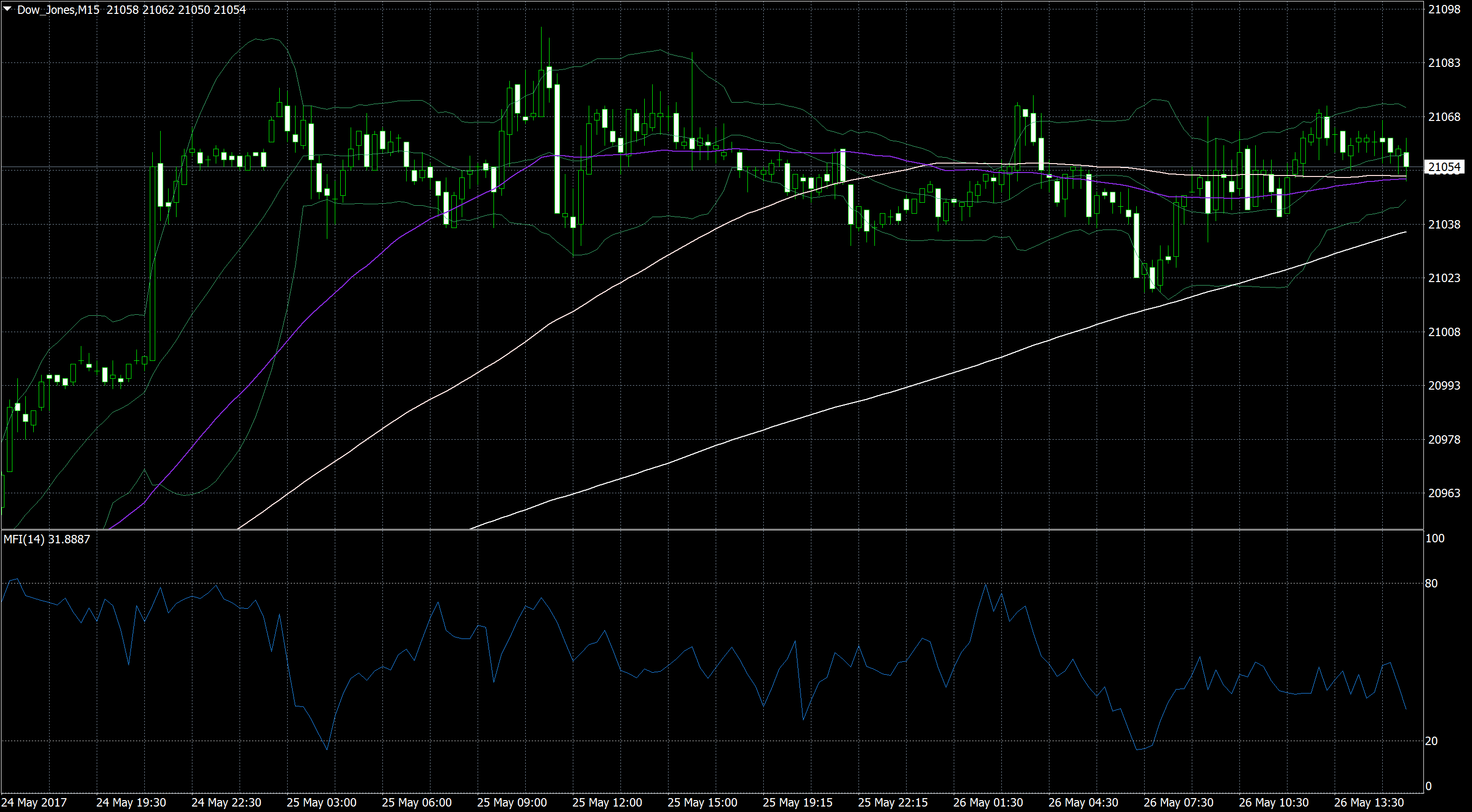
In this chart, we have also added the Money Flow Index (MFI). As you can see, the MFI has failed to reach an extreme area during the entire sideways movement. Apparently, traders are unwilling to push the market in either direction and back off every time before a movement can develop. This is an important indication that can help you find trading opportunities.
We now know two ways of creating trading signals:
- When the market nears the upper or lower ends of its trading range, invest in a reversal with a high/low option. If the market is near the upper end of the range, invest in a low option; if the market is near the lower end of the range, invest in a high option. The market is likely to reverse at least a few more times before the market breaks out of the trading range. You will eventually lose one of these trades, but until then, you should be able to win enough trades to make a significant profit.
- You can use the MFI to confirm your prediction and/or invest in a one touch option. Every time the MFI has neared an extreme, it has caused the market to turn around. The next time the market is close to the upper or lower end of the trading range and the MFI is close to an extreme area; both signals combine to a strong prediction – the market is likely to turn around and move quickly to the other end of the trading range. This knowledge allows you to trade a one touch option with a target price inside the trading range.
For both strategies, use an expiry of around 1 hour. This equals four periods.
Let’s take things one step further and zoom in one more period. We will find another possible trading strategy.
Step 4: The 5-minute chart
The 5-minute chart offers us another opportunity to win a binary option.
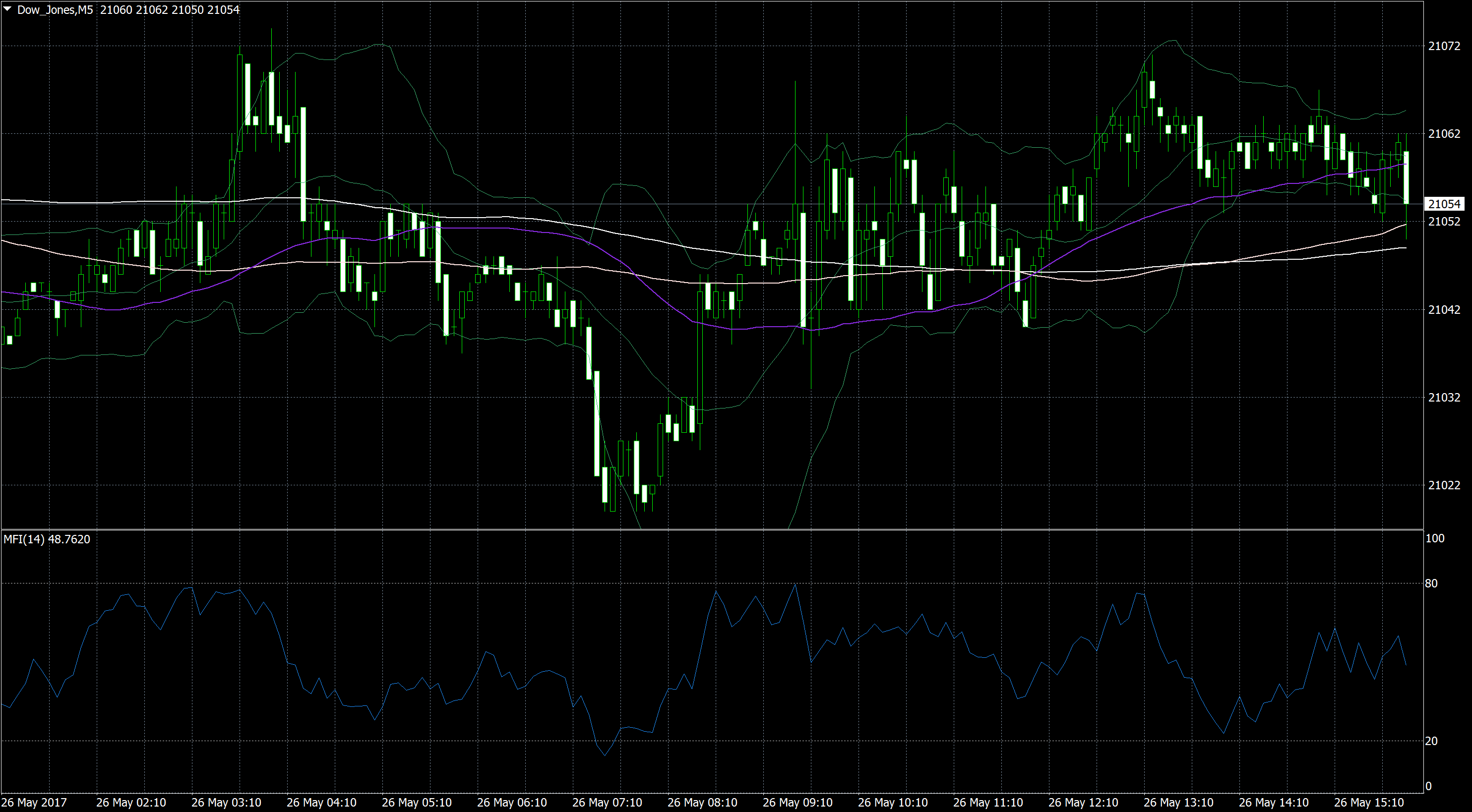
As you can see, the market has become significantly more volatile over the last candlesticks.
- The MFI failed to enter an overbought or oversold area over the last periods – a strong indication that the market is lacking direction.
- The last candlesticks have long wicks but short bodies, another strong sign of high
- All the three moving averages have changed direction often over the last periods and are mixed The third sign for a market environment without a clear direction.
In this environment, trading a high/low option is difficult. It is, however, great for a boundary option. Boundary options define two target prices in equal distance from the current market price – one to the top, one to the bottom. The market only has to touch either target price, and you win your option. In the current market environment, this is a highly likely prediction.
When the market is near the middle of the 21040 to 21070 trading range, and your broker offers you a boundary option with both target prices within these limits and an expiry of at least two periods (10 minutes), you have a high chance to win this option and get a good payout. With a little luck, you might even be able to trade a high-yield boundary option and get a payout of 250 to 300 percent.
Conclusion
These trades have already passed. Nonetheless, the reasoning behind them holds true and still applies to your current market environment. They offer an example of market analysis, or technical analysis, that can provide trade opportunities.
To perform a market analysis for binary options, start on a daily chart and work your way through shorter and shorter periods. Understand what is happening in each period and relate it back to what you have learned in longer periods. Then invest in the period which you consider the most profitable.
You have also seen the versatility of binary options. We have seen periods with very different market environments, but we have always found a way to trade these environments with digital trades. There will be times in which you are unable to find a profitable investment, but those times will be rare.
If you still need a broker with which to trade binary options, take a look at our list of the best brokers in the market: