In general, binary options are relatively short-term investments that require research and technical analysis. Because of this, analysing and interpreting binary options charts is extremely important to the success of any trader, as it will be hard to be profitable without knowing the ins and outs of chart reading and technical analysis. These trading charts do not have to be intimidating and you can be a successful trader by learning how to use charts to assist in your overall trading strategy.
Time frame
As binary options are frequently traded on relatively short-term time frames (Often end-of-day, hours, minutes or even 30 seconds), it is key to analyse charts within a given time frame that is in keeping with the trading style or analysis. For example, if trading an asset that expires in one hour, it is going to be of little value to look at charts with a five year time frame. Similar time frames might back each other up, confirming a trade, but there is a limit to the use of unrelated time-scales. Charts can be broken up into timeframes as follows: 1 minute, 2 minute, 5, 10, 15, 30, 45, 60, 90, daily, weekly, and monthly.
As mentioned above, on occasion, it might be advantageous to use multiple time frame charts when examining a possible binary option trade. When doing so, make sure to look at the longer time frame chart first – this should provide the overall longer term trend. From there, you can then scrutinise a shorter time frame chart, and establish an entry point you wish to get in the trade. As an example, if the daily chart is showing bullish signals but the weekly chart is showing bearish signals, traders may wait for the daily to turn bearish before placing your trade. The longer term trend will then hopefully be less likely to work against the shorter term trade.
Live Charts
Live charts are available at most trading brokers – do clarify though, that charts are “live” and not delayed by 15 minutes.
Types of Binary options chart
Candlestick charts
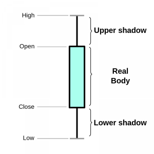 Many technical analysts believe that market trends are a reliable predictor of future events, but also provide entry and exit points too. Looking for indicators on a candlestick chart will allow you to decide whether it is the right moment to open any calls or puts. Candlestick charts are a visual mix between a line chart and a bar graph, making a combination that presents more information than is typically available in a more traditional chart. The name “candlestick” comes from the thin bars at the top and bottom, that display the high/low range of the day, plus opening and closing price (thus resembling the wick of a candle). These candles are arranged in the same way as a basic graph, with a new ‘candle’ for each unit of time. The ‘wicks’, and more importantly their relative length, can add additional information about trader sentiment.
A candlestick chart can alert traders to whether buyers or sellers are currently “winning the argument” in terms of the market of a particular asset. Utilising a candlestick chart along with several technical indicators can push your trading strategy to the next level.
For more in depth analysis of candlestick patterns, see our full article.
Binary Chart indicators
There are so many chart indicators to choose from it can make your head spin. (See why price action is important) Technical analysis is a huge subject, and one with very few definitive answers. All charts are useful in their own way, so it is important to understand how and when they should be used in your trading strategy. Let’s take a look at a few of them to give you an idea of how they can be utilised in binary options trading.
Moving averages – Many binary options traders utilise moving averages heavily. Some have even built trading strategies that revolve around asset prices crossing over moving averages over time. A moving average is a trend following indicator that is based on the historical price of an asset. Moving averages can be calculated in two ways, one in which all historical prices are weighted evenly (Simple Moving Average) or another in which more weight is given to more recent prices (Exponential Moving Average). Bullish and bearish signals are evident when the price of an asset crosses over its moving average, or when there is historical support of the price in relation to a moving average.
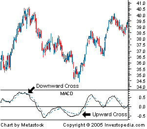
 Moving average convergence divergence (MACD) – MACD is the trend indicator that displays the relationship between multiple moving averages of an asset (the most commonly used values are 12, 26, and 9 day moving averages). Over time the MACD can display strong bullish or bearish signals depending on when the price of the asset and the MACD indicator are diverging, the MACD is rising dramatically, or there is a crossover of the MACD indicator and the signal line.
- Stochastic Oscillators – Stochastics – An indicator that compares an assets closing price to its price range over a given period of time. The theory behind stochastics is that in an upward-trending market, prices will usually close near their highs, and during a downward-trending market, prices will close near their lows. Stochastics are generally displayed in a number between 0 and 100, or -100 and 100. Traders begin to take note, once values move beyond 80, or 20 – assuming the scale is 0-100.
- Fibonacci numbers – Fibonacci was a mathematician who identified a sequence of numbers that were repeated throughout the natural world. More recently, analysts have noticed similar patterns often occur within the trading markets as well. They can often be used to try and establish support and resistance levels.
- Volatility – Not strictly a price chart, but the VIX measure of current volatility is a useful graph to keep an eye on. Particularly if the trading ‘greeks’ are important within your trading strategy. Boundary and Ladder options will be particularly sensitive to volatility, in terms of judging value.
- Relative Strength Index (RSI) – A momentum oscillator which measures the change and speed of price movement. It allows traders to spot overbrought or oversold assets, and ‘failure swings’. It moves between 0 and 100.
Binary options charts strategies in real time
While binary options charts can be extremely useful in determining entry points for binary options traders, and can provide valuable insight to the historical performance of an asset, they must be understood completely in order to be fully utilised. It is also important to not let emotions get in the way of what charts are displaying. If the moving averages have a significant trend to the downside such as a downward cross, don’t let your emotions tell you that this doesn’t matter. The indicators tell a story that as a trader you must listen to. Utilising charts can be very rewarding when done correctly, but you must first educate yourself and determine which patterns and technical indicators you prefer to use in your trading strategy. Each trading strategy will be as individual as the person using it, so there are few ‘right and wrong’ answers when it comes to charting. Demo accounts can be a good place to experiment with trading strategies and see what works.